Case Study  /  Information Architecture  /  WordPress

One program,
two camps,
one story

Mythik Camps added a second location. The existing page had no way to hold both without making them feel like competing products. The fix wasn't cosmetic — it was structural.

Goal: One identity, two locations
WordPress
Information Architecture
Client
Mythik Camps
Scope
Strategy · Content Architecture · WordPress Build
Platform
WordPress
Locations
2On one page, under one brand
The Problem
Same program.
New home.
Page didn't know that.

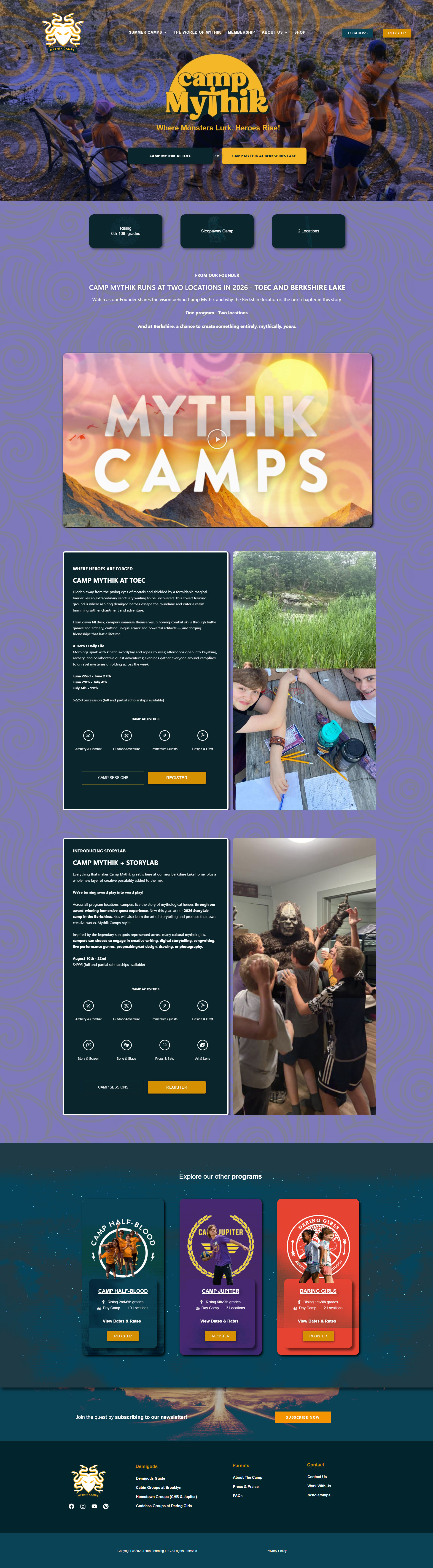
Mythik Camps runs one program — mythology-based sleepaway camp for 6th–10th graders. For 2026, that program expanded to a second location: Berkshire Lake, alongside the existing TOEC site. Same philosophy, same activities, new setting with one new addition: StoryLab.


The problem wasn't adding a new section. It was that the existing page structure had been built entirely around a single location. Adding a second the same way — two cards, side by side — would have made TOEC and Berkshire Lake read as competing products rather than two expressions of the same thing. Visitors would arrive at a decision they shouldn't have to make: which one is the real camp?


The framing problem was structural, not cosmetic. No amount of copy tweaking would fix it. The hierarchy had to change.

The Structural Gap
1 → 2
Locations to hold on a page built for one
0
Shared context in the original structure — nothing established the program identity before the new location was introduced
StoryLab
New program layer at Berkshire — needed to read as an expansion, not a differentiator that made TOEC feel lesser
The Build
Camp Mythik
mythikcamps.com/camp-mythik
Camp Mythik page — full view showing unified hero, anchor navigation, TOEC and Berkshire Lake sections
The Solution
Program identity first.
Location differences second.

The page was rebuilt around a simple principle: establish what Camp Mythik is before ever asking where. Every structural decision flows from that.

🏕️
Unified Hero
The hero establishes one brand — Camp Mythik — before any location is mentioned. Single tagline, single visual identity. Visitors arrive at the program, not a fork. The location choice comes only after they've decided they want to be there.
Brand First · IA
🎬
Founder Video as Framing Device
A "From Our Founder" section with a video was placed between the hero and the location sections. This does the critical work of explaining why there are two camps — and framing Berkshire Lake as the next chapter, not a parallel product — before any pricing or activity detail appears.
Content Strategy · Trust
📍
Parallel Location Sections
TOEC and Berkshire Lake each get their own full-width section with the same structural elements: description, activities grid, dates, pricing, and CTA. The visual parity signals that neither is the "main" camp — they're equals with different flavors.
Content Parity · Clarity
StoryLab as Expansion, Not Differentiator
Berkshire Lake introduces StoryLab — a new creative layer spanning storytelling, digital production, songwriting, and performance arts. The language and positioning frames it as something Berkshire gets on top of Camp Mythik, not instead of it. TOEC doesn't feel like the lesser option because the base program is identical.
Positioning · Framing
🧭
Consistent Activity Modules
Both location sections use the same four-icon activity grid (Archery & Combat, Outdoor Adventure, Immersive Quests, Design & Craft). Seeing the same activities reinforced by identical module design at both locations does more work than any headline could — it shows the program is the same.
Visual Consistency · Brand
The Strongest Decision
Two buttons.
One structural argument.

Before a visitor reads a word of body copy, the hero has already done the most important work. Two buttons, side by side, equal weight, equal position. Neither is primary. Neither is the default. That symmetry alone communicates something no headline could say as efficiently.

But the real decision is in the naming: "Camp Mythik at TOEC" and "Camp Mythik at Berkshire Lake." Both start with the brand. Every time a visitor sees those buttons, they read "Camp Mythik" twice before they ever read a location name. The brand is embedded in the action itself.

The visitor doesn't arrive at a choice between two camps. They arrive at Camp Mythik — and then decide where to go. That reframe is invisible to the visitor. That's exactly the point.

As it appears in the hero
Where Monsters Lurk. Heroes Rise.
Camp Mythik
Camp Mythik at TOEC
Camp Mythik at Berkshire Lake
Neither location is home base. The program is.
Under the Hood
Built on WordPress within Mythik Camps' existing custom theme. The page structure was rebuilt from the ground up — not retrofitted onto the old single-location layout. Anchor link navigation was implemented with the hero buttons targeting named sections below. The activity icon grid at both locations uses a shared widget component so any future update to the activity offering propagates to both sections simultaneously. Fully responsive with the location sections stacking cleanly on mobile.
WordPress Custom Theme Anchor Navigation Global Widget Sync Fully Responsive
The Result
A page that scales with the program

The rebuilt Camp Mythik page holds two full locations, a new program layer, and a Founder video — and reads as a single coherent product rather than a side-by-side comparison. The structure is designed to absorb future expansion: a third location, a new program track, or a seasonal variation can be added without re-architecting the page.

2
Locations
TOEC and Berkshire Lake on one page, under one unified brand
1
Hero
Single unified brand entry point before any location is introduced
StoryLab
New Program Layer
Launched as an expansion — positioned so TOEC still reads as complete
0
Redundant Decisions
Visitors choose a location after buying into the program — not instead of it